[livejournal.com profile] unicornpearlz asked: How the heck did you get so good at marketing?

I’d say there are probably three factors.

The first is just simple observation. Since no one can escape being marketed to, it makes sense for an engaged member of modern society to learn how mass media manipulate individuals and groups. This requires examining those media with a critical eye, giving thought to what the media are doing and how they go about doing it. I see that as just basic visual literacy.

The other is that it’s kinda of been part of my job. I’ve been designing Internet information systems since 1983, and that has included information architecture, data visualization, and (especially with the rise of the web) visual design. As such, I’ve gradually become attuned to the fact that layout and illustration do a whole lot more than just make a page look pretty; they control what information the user focuses on, what they perceive as important, and even how they react to that information.

In the early days, web developers and designers had to be jacks of all trades, and I was strong in technology, business strategy, and information design, but my weakest point has always been the creative side of visual design. Thus, the third factor: in 2001 I started classes at the New England School of Art and Design, with the idea of picking up a certificate in electronic graphic design. In 2005, due to extraordinary events in my life, I walked away from the program with just one class left to matriculate. But by then I’d gained all the knowledge I was going to get from the program.

Knowing I sucked at graphic design, that was an interesting and conscious exercise. When one is young, you always play to your strengths, looking for a job you will excel at; when you’re older, you start thinking more about new, more ambitious challenges and the value of exploring and strengthening the areas you’ve always found most difficult. When I started classes at NESAD, my work was actually well ahead of that of the kids in my classes, but over time, my work stayed at about the same level, while theirs improved dramatically. What I did gain was a better understanding of design and designers, and the incredible insights of the Bauhaus movement.

At the same time, it pretty much confirmed my lack of confidence in my creative ability. While I have expert skills providing critiques and making suggestions, and moderate skill at taking an existing design and improving it substantially, I’m an utter failure if I have to start with a blank page; the ideas just don’t come. So I didn’t overcome my weakness, but I definitely learned a lot, and refined my understanding of my limitations.

What’s ironic is that this lack of creative confidence has spread to my fiction writing, as well, which is one (of many) reasons why I decided to end my involvement with DargonZine. Fortunately, at least it hasn’t interfered with my blogging or photography, which have been my major “creative” outlets in recent years.

But really, I think my first two survey courses in graphic design were the most valuable in terms of gaining a degree of visual literacy. They taught me how to look at a piece of media and evaluate it from a designer’s perspective, and some of the techniques and methods used to influence the viewer, whether subtly or otherwise.

EOY

Dec. 31st, 2005 04:26 pm

I know it’s tedious to read about everyone’s end-of-year natterings, so I’ll keep mine brief.

Having just gone through a very difficult period, I’m naturally inclined to write 2005 off as just a series of very painful events. However, when I went to make a list of the good and the bad, I discovered a very surprising and substantial imbalance toward the good. This year in particular this list seems to really help keep things in perspective.

So here’s my lists:

The Bad The Good
  • Puggle’s sudden death
  • Inna’s hospitalization
  • Abandoning my graphic design certificate program
  • The damage done to my ceilings by leaks in the building’s A/C system
  • Having to send back my new Dell laptop as defective
  • The brouhaha with my bike shop over replacing my headset
  • Early-season difficulties on the bike due to my back and seat
  • I never had the time to get started in sea kayaking this year
 
  • Got a new job and began making money again
  • DargonZine went back into circulation, printing the first half of the long-awaited Black Idol story arc, our most ambitious collaboration ever
  • Those included “Liberated Hope”, a two-chapter story of my own
  • Made a ton of positive progress in incorporating Buddhist philosophy into my life
  • Bought a very nice brand new road bike
  • Realized a longstanding dream by taking the train up to Portland, Maine and biking from there to Augusta
  • Had three pieces of artwork displayed publicly at my art school’s senior show
  • Met several prominent personalities, including Benoit Mandelbrot, Greg Hawkes, Ajahn Brahm, and Terry Pratchett
  • Had a tremendously enjoyable and successful Pan-Mass Challenge charity ride
  • Attended a pleasant Dargon Writers’ Summit in Traverse City, Michigan
  • Learned how to do my own artistic bookbinding
  • Went for a schooner ride in Camden, Maine with my brother
  • Began attending friendly scotch nights and picked up a rare bottle of Port Ellen at a local tasting
  • Got back into the swing of playing Diplomacy and learned how to play the excellent game Settlers of Catan
  • Got back into and put in a good showing at some friendly poker games, then had a very profitable blackjack outing at Foxwoods
  • Got the bloaty-ohs attending my first Scooper Bowl: an all-you-can-eat ice cream charity event
  • Bought an iPod Nano
  • Joined the ACLU in response to the US government’s unabashed assault on human rights both domestically and abroad
  • Had a fun time showing my friend Tasia around Boston

So that’s the scoop. As you can see, the positives far outweigh the negatives, even if there were a couple really, really terrible things that happened this year.

Funny that just as I’m putting so much time and energy into being someone else’s pillar of strength, so many bad things are happening to me.

Yesterday it was the bike. I took my bike to the shop for an unrelated fix, and they say they need to replace the headset, which they installed brand new just five weeks earlier.

As if that wasn’t enough gross incompetence, they don’t have the parts, and the guy who took my bike apart isn’t capable of putting it back together again using the old parts, so I have to survive the next ten or more days without my primary mode of transportation to my job or to the hospital to support my best friend in her time of need, and without any ability to continue training for my charity ride.

On top of the existing issues with the ceiling leak, falling behind in class, and being behind schedule in the fundraising for the charity ride, this is really getting discouraging. June (and perhaps now July?) seems to have been officially declared “National Kick Orny in the Teeth Month”. What crisis am I gonna have to endure next?

Wow. What a life it has become. I wish I could update you on everything that’s gone on, but everything that’s going on prohibits me from actually doing so. You’ll get some updates, but I’m afraid it’s not gonna be in the short term, because all of a sudden I find myself under incredible time stress.

There are really five major demands on my time. The first is this new job, which as consulting jobs go really hasn’t been bad so far.

The second is that at about the same time as I started work, a very close friend was hospitalized. I’m not going to get into the details of that, but I’ll be setting up a filter for posts relating to that, if I ever find the time to write them.

Between those two things, I’ve literally spent all my time either at work, at the hospital, or sleeping (and sleep time has already been cut by 50 percent).

On top of that, my final class in my graphic design program has started, and I’ve already fallen behind. Getting caught up is going to be a huge struggle from now through mid-August, when the class ends.

Then there’s my annual cancer charity ride, which is only six weeks away. I have to really get back into training mode, and start raising some money. I usually start at the end of May, but so far this year I’ve only raised $20 out of the $3,000 I need. Fortunately, at least I’m not responsible for it until the middle of October, even if the ride takes place in August.

And, of course, there’s a bunch of DargonZine work that came out of our 2005 Writers’ Summit, which is the topic for another post that I have been hoping to make.

So I’m here, but I haven’t been under this kind of stress in a long, long time. I’m really hopelessly swamped right now. Maybe I should be making more use of LJ’s post-by-phone facility.

A week ago, I helped put up my art school’s senior show, wherein our graduating class of about 18 graphic designers show off their stuff.

Now that the show has been up for half a week, yesterday was our artists’ reception, the tacky little party where all the kids get to show off their work to their family and friends in the school’s main gallery.

I intentionally did not check the show out before the reception, because I wanted to have something to do that night other than stand around looking conspicuously uncomfortable. I despise parties to begin with, and I purposely did not invite any of my own friends or my geriatric family to the show. Irrespective of that fact, the show was an absolute crush of people, and the gallery was more comparable to a noisy mosh pit than an appreciation of the displayed art. I even saw people walking away in disgust because the gallery was too hot, too crowded, and too noisy for them to actually look at the work.

Early on, before it got too crowded, I did take the time to look at the show, and I was really impressed with both the quantity and the quality of what my class has produced.

Illustrative Type Magazine Spread

On the other hand, I remain acutely disappointed with my own work. Two years ago I would have told you that I was surprised that my work was among the better stuff, but I seem to have lost a lot of ground since then. Other than photography, I don’t think I’ve done anything of decent quality in a long time, which discourages me.

In the end, only three pieces of mine were selected for the show. One was a passable magazine spread I did two years ago, another was a handmade book which I’m not entirely happy with because it had very little graphic design to it, and the third was a collaboration with three other artists, who were largely responsible for its final quality. You can peruse those pieces in this photo gallery.

With this semester ending in a week or two, the only class I have left will be a short portfolio prep course this summer. I’m still glad that I went through this program. My goal was to learn more about graphic design and address a known weakness. I think I’ve learned that I’m still definitely deficient in graphic design skills, most notably visual creativity. However, I understand the process much better, and I realize that I am capable of competent, albeit not innovative, design.

Most of my self-worth is derived from competence—nay, expertise in whatever I choose to do. For that reason, it was very challenging for me to go into art school, because I was putting myself in a position where I had to reveal a known incompetence to people with vastly more innate talent than I will ever have. It remains intensely difficult for me to admit that although I’ve been through art school, I still am not able to predictably and reliably create anything as aesthetic as many people do naturally.

However, I’m slowly coming to accept that shortcoming, and am increasingly able to objectively assess where I fall on the continuum of artistic skill. I find it’s all very reminiscent of the discussion I described in this recent LJ post about arrogance, acknowledging my own fallibility and respecting those whose skills and knowledge exceed mine. But, boy, that doesn’t make it less hard.

Cover Girl

Sep. 8th, 2004 09:55 am

NESAD catalogSo yesterday evening I mosey on down to the New England School of Art and Design at Suffolk University (NESAD) for the first session of my penultimate graphic design class. Incidentally, it’s a class with a female instructor and twelve female students—most of whom I know from previous classes—and me.

I walked in and before I could even sit down, Ellen is giving me shit about presumably being on the cover of some NESAD brochure. I express my disbelief in typically eloquent fashion, but follow up on her challenge to go check it out.

In a couple of the literature racks around the building I find a white 5.5 x 8.5" brochure—NESAD’s continuing ed fall 2004 course catalog— and, yes, I’m right there on the cover.

I’m there in full skinhead glory, wearing my green Toasters tee shirt, jaw hanging open, cutting a mat for a print in Ken Martin’s spring photography class. Clearly, it was one of the shots he took while we were working. Goof.

Amusingly, the image is repeated on page 12, the “Administrators” page, but it’s been mirrored, so that I’m facing left instead of right. Like no one is gonna notice that? Amateurs…

But I must say, it’s pretty amusing to think that they’d choose my image to sell the school, even to continuing ed students. But, hey: I made the cover! Makes me wonder about whether I should have pursued that modeling career I looked into ten years ago…

Boston's Big DigVisit to the doghouseMaking way for the new
Geometric ascentNature and geometry
Last week was my final Digital Photography class, and we had to turn in our final project: a portfolio of ten photographs, all relating to a certain topic.

I spent a lot of time out shooting, but only tied my images together vaguely with verbal bullshit. However, here are a few of the images I kept.

The top row includes: a nice shot of the Big Dig with a tangle of rebar in front of the Customs House tower, a basset hound shot in front of the State House at the annual “Patriot Plod” basset parade, and a stitched panoramic shot of a support for the old High Bridge in front of one of the towers of the new Zakim bridge that replaced it.

The images in the second row are intentionally a little obscure. The first is on the grounds of the JFK Library, and the second is in the park around Cambridge’s Fresh Pond.

In all, I’m pretty happy with how this assignment turned out, as well as how the class overall went. Hopefully this won’t be the end of the photos that I take or post here. I really enjoy the work, and would love to be able to turn it into something I could make some income from.

Mount Auburn Cemetery
Boston Public Garden
Three more weeks of Digital Photography class have yielded two more photos to share.

Both of these pictures were experiments in depth of field. The unfortunate thing is that when you reduce the size of a photo, it totally flattens the depth of field, so that areas that were out of focus on the original look about the same as the in-focus areas. But trust me on this one: the originals look really cool.

The first image was taken at Mount Auburn Cemetery, where people like Harold Edgerton, B.F. Skinner, and Henry Wadsworth Longfellow are buried. The spruce bough in the foreground is in sharp focus, while the tombstones in the background (with the shadows of the same boughs on them) are blurry.

The second shot was more serendipitous. We were shooting flowers in the Public Garden, and I wanted to shoot these two foot tall lily plants, but couldn’t take a side shot because the only backgrounds I could set them against were people or cars parked along a street. So I walked up and took a shot pointed straight down, and got a tremendous image. The leaves spiraling out from the central stem work great with the limited depth of field, which left the ground and the lower leaves a bit blurry.

I’m really pleased with how these two images came out, and look forward to playing around and building up a higher level of proficiency with controlling depth of field.

kiddie protesterlamppost bill
I can’t say I’ve been thrilled with recent expeditions during my digital photography class. We did an event shoot at a lecture that really didn’t work out well at all; I won’t even bother posting anything from that.

The next week we walked over to the State House and shot the protests (both for and against) during the debate over same-sex marriage. The first shot you see here is from that. It’s not a great photo, but shooting a protest is surprisingly difficult. If you can’t see it well at this size, it’s an eight year-old child holding a placard saying “Sodomy is sin”. I wanted to stop and ask him if he knew the definition of “sodomy”, but I was trying hard to maintain journalistic neutrality.

This week we wandered around Boston’s South End, which was a little more fertile territory, but I still wound up with a favorite image that isn’t particularly artistic, but more found humor. In this case, it’s from a bill that had been taped to a lightpost and later torn off, leaving only the well-taped shreds of paper and the very Zen message “Everything Must Go!!!!”

Maybe things will improve in coming weeks. I’d like to have something a little more artistic to show you than these…

Stairwell Portrait
Here are a couple more shots from Digital Photography class. The first is the standard stairwell shot, and the other something from our day spent shooting portraits. We’ve also done a still life / product shot and two event shoots: one a panel discussion, the other the protests at the state house over same-sex marriage. However, I’m really not happy enough with any of those to share.

Since coming to Boston and getting involved in the local music scene, one of my dreams has been to do concert photography. I still take my camera to assorted shows and sometimes wind up with something particularly nice, like this shot of Prince Buster, or the shots of the Bentmen and Beat Soup that I haven’t put up.

One thing I’m happy about is that the Allstonians have put up some pictures I took of them at a free outdoor show at City Hall for Boston Harborfest. You can see them here, but be warned that only the first four, and #9, are mine.

I want to do a lot more of this, and hopefully build up both a reputation and learn more techniques for low-light work.

NESAD outreachWhile I haven’t talked about it much, I’ve been in art school for a couple years. I’m going for… (take a deep breath)… a Certificate in Electronic Graphic Design from the New England School of Art and Design (aka NESAD) at Suffolk University. (Okay, breathe again).

This semester’s class is Digital Photography, which has been one of my passions for over a decade. The good part is that we’re learning more about general photographic techniques than the technology, which is good, because I could teach courses in the latter.

But since my readers have given me positive feedback when I’ve included photos in my journal, I thought I’d share a few of my better images for class from time to time. So here are two.

At our second class meeting, there was a Suffolk outreach program going on at NESAD, so we rushed upstairs to shoot it. While looking for shots, I spied a sandwich on a plate underneath a chair; some college student was still too finicky to eat the crust of their bread! It was right next to one of the paint-spattered art stools with two outreach flyers and a cup of water, which perfectly complemented the sandwich. I think the photo’s a real winner.

North End shopOur next class was spent wandering all over Boston on an architectural shoot, but again serendipity provided a wonderful shot of these flavored syrup bottles in the window of a North End shop. I wish I’d had more time, so that I could actually set the shot up properly.
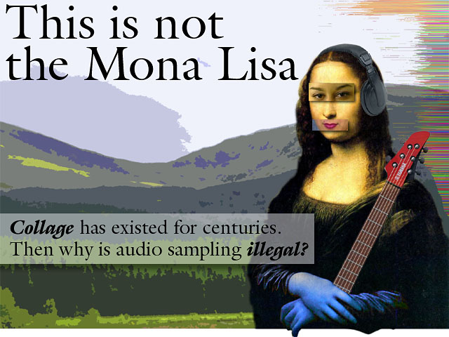
Of course, both images are much more appealing when printed 7x10 or displayed full size, but I’m not going to put all the biggies up for you. Though perhaps it is almost time to put up an online portfolio of photos, print work, and Web design.

More images as the class progresses… I hope you enjoy.

Looks like the children running the Friday Five are doing their best to prove their incompetence again, repeating the same inane, predictable questions over and over again. How difficult can it be to come up with five unique questions each week? Especially when you consider they have a readership of thousands who continually feed them prospective new questions? The dearth of originality has me once again on the verge of quitting and deleting all the Friday Five postings I’ve ever made. Another week with questions as pathetic and redundant as these, and I’ll do just that.

Are you going to school this year?
I’ve been going to the New England School of Art and Design at Suffolk University for a Certificate in Electronic Graphic Design for the past two years. However, I decided to take an LOA this semester to conserve cash and concentrate on my job search. However, I am hoping to take a short course in Macromedia Flash at MassArt in October.
 
If yes, where are you going (high school, college, etc.)? If no, when did you graduate?
See above.
 
What are/were your favorite school subjects?
You asked this question last year, stupid. See my response here.
 
What are/were your least favorite school subjects?
Probably sciences and maths. The former were just a joke, and the latter utterly impractical.
 
Have you ever had a favorite teacher? Why was he/she a favorite?
You asked this question last year, stupid. See my response here.
This is not the Mona Lisa

In one of my art school classes this semester I did a series of collages based on famous paintings: the Mona Lisa, Whistler’s Mother, and American Gothic. The point was to draw a parallel between visual collage, a long-accepted art form, and audio sampling as “aural collage”, which has been villified as copyright infringement. My Mona piece appears at right (click for a larger version).

Brian, my teacher for that class, spent the spring break on a long-planned trip to Paris. Being a professional illustrator and art school teacher, he of course went to the Louvre. Can you see where this is headed?

Yes, he saw the one and only original Mona Lisa. And when he did, all he could think about was my project. Yes, I completely ruined it for him! I have that power. He couldn’t so much as glance at that masterpiece without asking himself “But what about the blue hands?!?”

So the strangest thing just happened to me in Graphic Design class. We were showing our preliminary designs for a small poster with an abstract design composed entirely of letters, numbers, and symbols from a typeface that we had chosen.

Frutiger Poster

The typeface I had selected was Frutiger, which was designed specifically for — and made famous by — the Charles de Gaulle airport outside Paris in the early '70s.

My design featured a series of letters whose forms made a kind of sophisticated pipeline around three sides of the poster, and the upper right quarter of an immense grey 'X', and a series of numbers that went along the edge of the 'X' in perspective. I was trying to be smart by creating a cognitive dissonance with things overlapping the "wrong" way in perspective and a bunch of other stuff that doesn't really matter. The result looked reasonably good, but I felt it needed some tweaking to achieve my goals.

Well, imagine my surprise when I tacked the thing up and the first comment out of the instructor's mouth was "This just screams 'airport'", and it totally did! My nice black pipeline looked just like a stylized map of a circuit road, and the big grey 'X' couldn't have looked more like a runway than if I'd tried, and came complete with big runway numbers along it!It really did scream "airport".

Knowing that Frutiger was designed specifically for an airport, the poster couldn't have possibly been a more perfect interpretation of its original context! And the thing that absolutely floors me is that it was so completely NOT what I was thinking when I laid the thing out!

Too bizarre. Just too bizarre.

Frequent topics